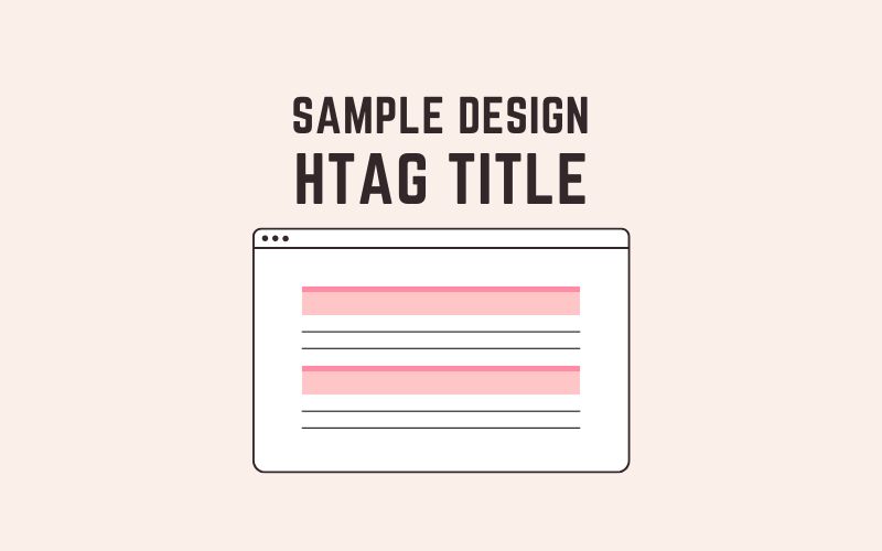
見出し・タイトルで使えるデザインサンプルを35種類、どどどっとご紹介します。
このデザインサンプルでは、h1タグに対してCSSを適用しています。詳しいコードの解説は省いていますが、コピペで利用できますので、お気軽にご活用ください。
目次
使い方
HTMLはこちらをコピーしてご利用ください。
デザインサンプルはこのソースに対してCSSを適用させています。
<h1>見出し・タイトル</h1>デザインサンプル
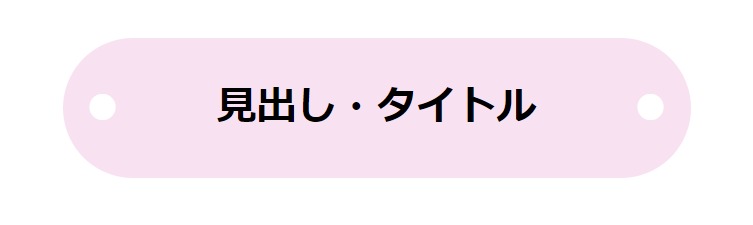
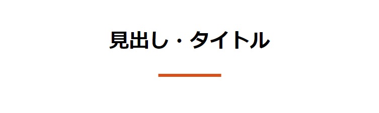
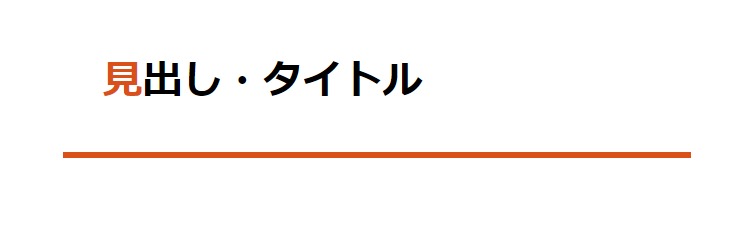
ベーシックなデザイン
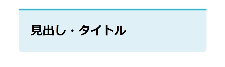
背景色入り
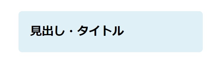
h1 {
  padding: 1em;
  border-radius: 10px;
  background: #DFF1F6;
}
影付き文字
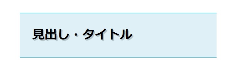
h1 {
  padding: 1em;
  text-shadow: 3px 3px 1px rgba(0,0,0,0.2);
  border-top: 2px solid #42AAC7;
  border-bottom: 2px solid #42AAC7;
  background: #DFF1F6;
}
上に太めのライン
h1 {
  padding: 1em;
  border-top: 5px solid #42AAC7;
  border-radius: 0 0 10px 10px;
  background: #DFF1F6;
}
左に太めのライン
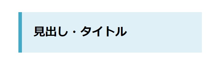
h1 {
  padding: 1em;
  border-left: 10px solid #42AAC7;
  background: #DFF1F6;
}
L字にライン
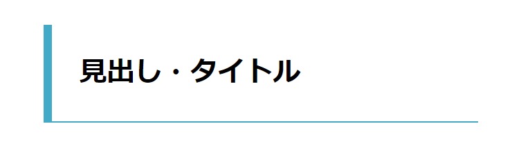
h1 {
padding: 1em;
border-left: 10px solid #42AAC7;
border-bottom: 2px solid #42AAC7;
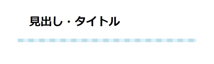
}点線のアンダーライン
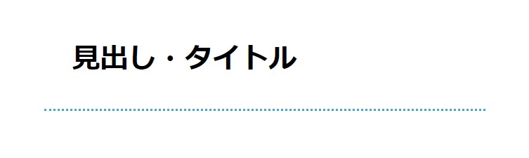
h1 {
  padding: 1em;
  border-bottom: 3px dotted #42AAC7;
}
カジュアル・やわらかなデザイン
斜線のアンダーライン
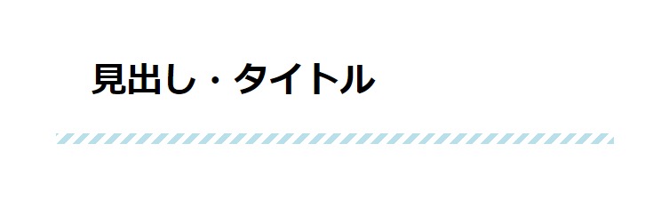
h1 {
  position: relative;
  padding: 1em;
}
h1:after {
  position: absolute;
  content: "";
  left: 0;
  bottom: 0;
  width: 100%;
  height: 10px;
  background: repeating-linear-gradient(-45deg, #B8DFEA, #B8DFEA 5px, #ffffff 5px, #ffffff 10px);
}
斜線の背景色
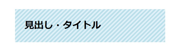
h1 {
  position: relative;
  padding: 1em;
  background: repeating-linear-gradient(-45deg, #B8DFEA, #B8DFEA 5px, #DFF1F6 5px, #DFF1F6 10px);
}
縦ボーダーでアンダーライン
h1 {
  position: relative;
  padding: 1em;
}
h1:after {
  position: absolute;
  content: "";
  left: 0;
  bottom: 0;
  width: 100%;
  height: 10px;
  background: repeating-linear-gradient(90deg, #B8DFEA, #B8DFEA 15px, #DFF1F6 15px, #DFF1F6 30px);
}
穴あき付箋風1
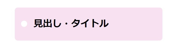
h1 {
  position: relative;
  padding: 1em 1em 1em 2em;
  border-radius: 10px;
  background: #f8e2f2;
}
h1::before {
  position: absolute;
  content: '●';
  left: 0.5em;
  color: #ffffff;
}
穴あき付箋風2
h1 {
  position: relative;
  padding: 1em 2em;
  text-align: center;
  border-radius: 2em;
  background: #f8e2f2;
}
h1::before, h1::after {
  position: absolute;
  content: '●';
  color: #ffffff;
}
h1::before {
  left: 0.5em;
}
h1::after {
  right: 0.5em;
}
ドットの枠線
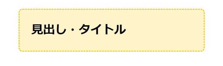
h1 {
  padding: 1em;
  border: 3px dashed #F6CA06;
  border-radius: 10px;
  background: #FEF4CA;
}
縫い目風
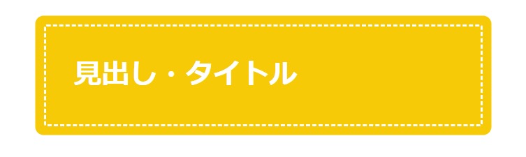
h1 {
  padding: 1em;
  color: #ffffff;
  border-radius: 3px;
  border: 3px dashed #fff;
  background: #F6CA06;
  box-shadow: 0 0 0 10px rgba(246, 202, 6);
}
吹き出し風
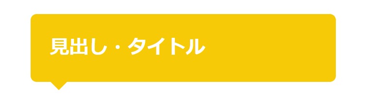
h1 {
  position: relative;
  padding: 1em;
  color: #ffffff;
  border-radius: 10px;
  background: #F6CA06;
}
h1::after {
  position: absolute;
  content: '';
  left: 1em;
  bottom: -28px;
  width: 0;
  height: 0;
  border-top: 15px solid #F6CA06;
  border-right: 15px solid transparent;
  border-left: 15px solid transparent;
  border-bottom: 15px solid transparent;
}
リボン風
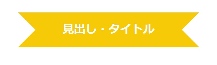
h1 {
  position: relative;
  padding: 1em;
  color: #ffffff;
  line-height: 1;
  text-align: center;
  background: #F6CA06;
}
h1::before, h1::after {
  position: absolute;
  content: '';
  top: 0;
  width: 0;
  height: 0;
}
h1::before {
  left: 0;
  border-top: 1.5em solid transparent;
  border-right: 1.5em solid transparent;
  border-left: 1.5em solid #ffffff;
  border-bottom: 1.5em solid transparent;
}
h1::after {
  right: 0;
  border-top: 1.5em solid transparent;
  border-right: 1.5em solid #ffffff;
  border-left: 1.5em solid transparent;
  border-bottom: 1.5em solid transparent;
}
背景色入り(影付き)
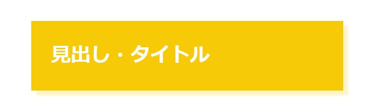
h1 {
  padding: 1em;
  color: #ffffff;
  background: #F6CA06;
  box-shadow: 8px 8px 3px 0px rgba(254, 244, 202);
}
グラデーションの背景色
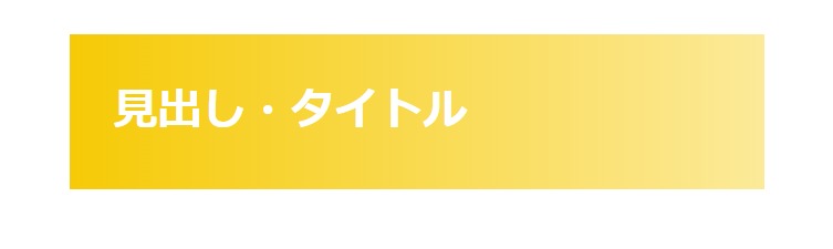
h1 {
  padding: 1em;
  color: #ffffff;
  background: linear-gradient(to right, #F6CA06, #FCEA99);
}
グラデーションのアンダーライン
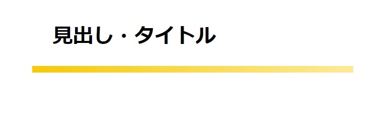
h1 {
  position: relative;
  padding: 1em;
}
h1::after {
  position: absolute;
  content: '';
  left: 0;
  bottom: 0;
  width: 100%;
  height: 10px;
  background: linear-gradient(to right, #F6CA06, #FCEA99);
}
飾り・アクセントを加えたデザイン
中央寄せで短めの飾り線
h1 {
  position: relative;
  text-align: center;
  padding: 1em;
}
h1::after {
  position: absolute;
  content: '';
  left: 50%;
  bottom: 0;
  transform: translateX(-50%);
  width: 100px;
  height: 5px;
  background: #DA5019;
}
中央寄せで三角▽マーク
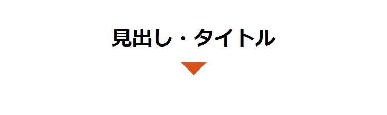
h1 {
  position: relative;
  padding: 1em;
  text-align: center;
}
h1::after {
  position: absolute;
  content: '';
  left: calc(50% - 20px);
  bottom: -20px;
  width: 0;
  height: 0;
  border-top: 20px solid #DA5019;
  border-right: 20px solid transparent;
  border-left: 20px solid transparent;
  border-bottom: 20px solid transparent;
}
上下に飾り線
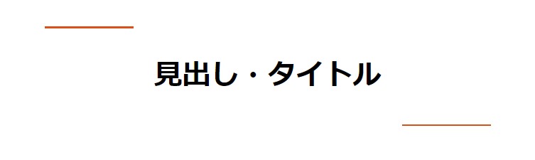
h1 {
  position: relative;
  text-align: center;
  padding: 1em;
}
h1::before, h1::after {
  position: absolute;
  content: '';
  width: 100px;
  height: 2px;
  background: #DA5019;
}
h1::before {
  left: 0;
  top: 0;
}
h1::after {
  right: 0;
  bottom: 0;
}
かぎかっこ「」
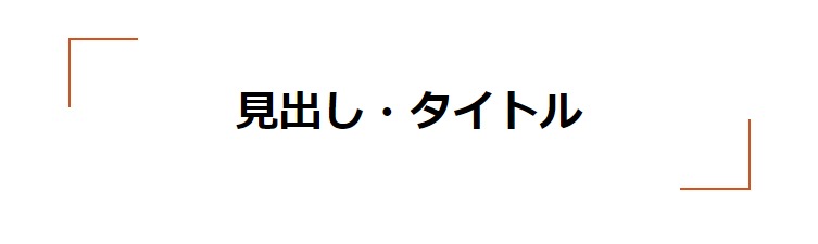
h1 {
  position: relative;
  text-align: center;
  padding: 1em;
}
h1::before, h1::after {
  position: absolute;
  content: '';
  width: 50px;
  height: 50px;
}
h1::before {
  left: 0;
  top: 0;
  border-top: #DA5019 solid 2px;
  border-left: #DA5019 solid 2px;
}
h1::after {
  right: 0;
  bottom: 0;
  border-right: #DA5019 solid 2px;
  border-bottom: #DA5019 solid 2px;
}
かぎかっこ [ ]
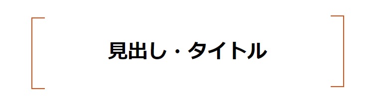
h1 {
  position: relative;
  text-align: center;
  padding: 1em;
}
h1::before, h1::after {
  position: absolute;
  content: '';
  width: 20px;
  height: 100%;
  border-top: #DA5019 solid 2px;
  border-bottom: #DA5019 solid 2px;
}
h1::before {
  left: 0;
  top: 0;
  border-left: #DA5019 solid 2px;
}
h1::after {
  right: 0;
  bottom: 0;
  border-right: #DA5019 solid 2px;
}
文字横に飾り線
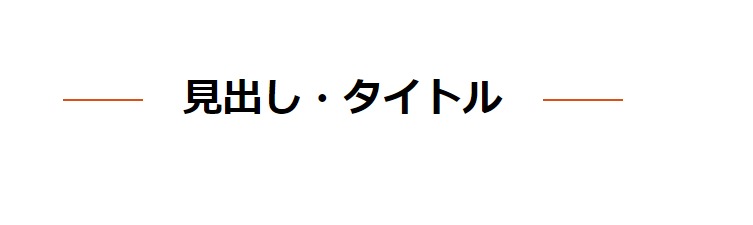
h1 {
  position: relative;
  display: inline-block;
  padding: 1em 3em;
}
h1::before, h1::after {
  position: absolute;
  content: '';
  top: calc(50% - 1px);
  width: 2em;
  height: 2px;
  background-color: #DA5019;
}
h1::before {
  left:0;
}
h1::after {
  right: 0;
}
文字横に斜線
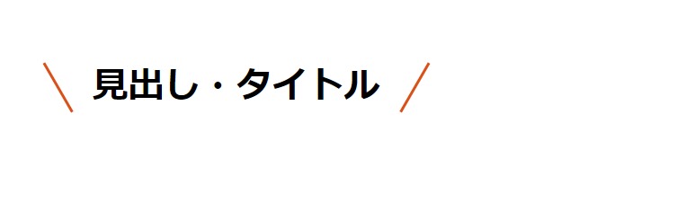
h1 {
  position: relative;
  display: inline-block;
  text-align: center;
  padding: 1em;
}
h1::before, h1::after {
  position: absolute;
  content: '';
  top: calc(50% - 25px);
	height: 50px;
  border-left: #DA5019 solid 3px;
}
h1::before {
  left:0;
  transform: rotate(-30deg);
}
h1::after {
  right: 0;
  transform: rotate(30deg);
}
2色でアンダーライン
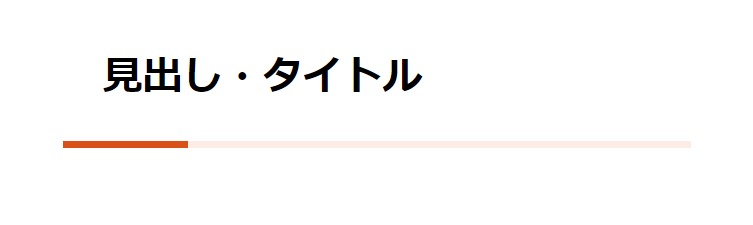
h1 {
  position: relative;
  padding: 1em;
}
h1::before {
  position: absolute;
  content: '';
  left: 0;
  bottom: 0;
  width: 100px;
  height: 5px;
  background: #DA5019;
  z-index: 1;
}
h1::after {
  position: absolute;
  content: '';
  left: 0;
  bottom: 0;
  width: 100%;
  height: 5px;
  background: #FCECE5;
}
ひと文字目にアクセント
h1 {
  padding: 1em;
  border-bottom: #DA5019 solid 5px;
}
h1:first-letter {
  color: #DA5019;
}
見出し番号入り
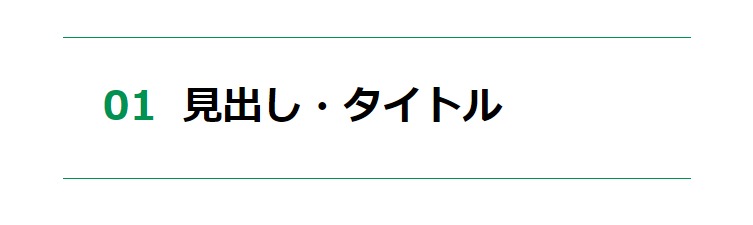
h1 {
  position: relative;
  padding: 1em 1em 1em 3em;
  border-top: #009250 solid 1px;
  border-bottom: #009250 solid 1px;
}
h1::before {
  position: absolute;
  content: '01';
  left: 1em;
  color: #009250;
}
見出し番号をアレンジ1
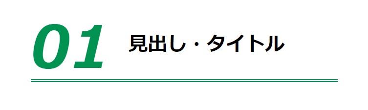
h1 {
  position: relative;
  padding: 1em 1em 1em 5em;
  border-bottom: #009250 double 5px;
}
h1::before {
  position: absolute;
  content: '01';
  font-size: 300%;
  font-style: italic;
  line-height: 1;
  left: 0;
  bottom: 0;
  color: #009250;
}
見出し番号をアレンジ2
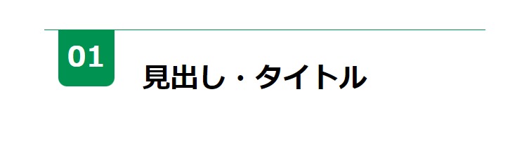
h1 {
  position: relative;
  padding: 1em 1em 1em 3.5em;
  border-top: #009250 solid 1px;
}
h1::before {
  position: absolute;
  content: '';
  top: 0;
  left: 0.5em;
  width: 2em;
  height: 2em;
  border-radius: 0 0 10px 10px;
  background: #009250;
}
h1::after {
  position: absolute;
  content: '01';
  top: 0;
  left: 0.5em;
  width: 2em;
  text-align: center;
  line-height: 2em;
  color: #ffffff;
}
テキストを追加
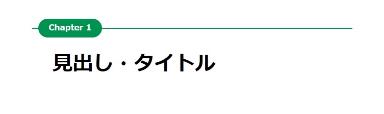
h1 {
  position: relative;
  padding: 1em;
  border-top: #009250 solid 2px;
}
h1::before {
  position: absolute;
  content: '';
  top: -16px;
  left: 10px;
  width: 100px;
  height: 30px;
  border-radius: 30px;
  background: #009250;
}
h1::after {
  position: absolute;
  content: 'Chapter 1';
  top: -16px;
  left: 10px;
  width: 100px;
  color: #ffffff;
  font-size: 13px;
  line-height: 30px;
  text-align: center;
}
リボン風の飾り入り
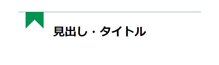
h1 {
  position: relative;
  padding: 1em 1em 1em 3em;
  border-top: #009250 solid 1px;
}
h1::before {
  position: absolute;
  content: '';
  top: 0;
  left: 20px;
  width: 50px;
  height: 45px;
  background: #009250;
}
h1::after {
  position: absolute;
  content: '';
  top: 21px;
  left: 20px;
  width: 0;
  height: 0;
  border-top: 25px solid #transparent;
  border-right: 25px solid transparent;
  border-left: 25px solid transparent;
  border-bottom: 25px solid #ffffff;
}
三角の飾り入り
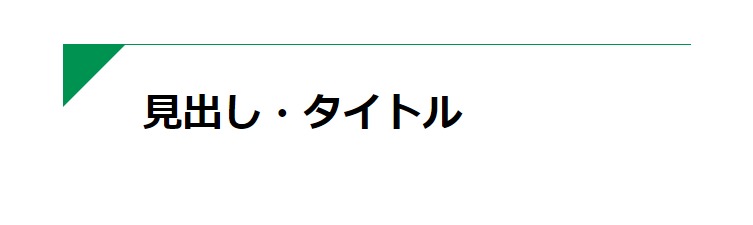
h1 {
  position: relative;
  padding: 1em 1em 1em 2em;
  border-top: #009250 solid 1px;
}
h1::after {
  position: absolute;
  content: '';
  top: 0;
  left: 0;
  width: 0;
  height: 0;
  border-top: 0px solid transparent;
  border-right: 50px solid transparent;
  border-left: 50px solid #009250;
  border-bottom: 50px solid transparent;
}
帯を多角形に
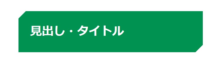
h1 {
  position: relative;
  padding: 1em;
  color: #ffffff;
  background-color: #009250;
}
h1::before {
  position: absolute;
  content: '';
  top: 0;
  left: 0;
  width: 0;
  height: 0;
  border-top: 0px solid transparent;
  border-right: 20px solid transparent;
  border-left: 20px solid #ffffff;
  border-bottom: 20px solid transparent;
}
h1::after {
  position: absolute;
  content: '';
  right: 0;
  bottom: 0;
  width: 0;
  height: 0;
  border-top: 20px solid transparent;
  border-right: 20px solid #ffffff;
  border-left: 20px solid transparent;
  border-bottom: 0px solid transparent;
}
帯の折り返しをイメージ
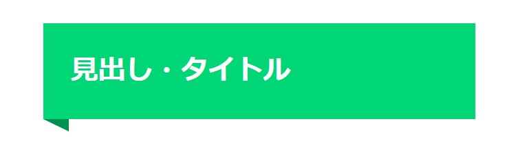
h1 {
  position: relative;
  padding: 1em;
  color: #ffffff;
  background: #00d675;
}
h1::after {
  position: absolute;
  content: '';
  top: 100%;
  left: 0;
  border-top: 15px solid #009250;
  border-right: 0px solid transparent;
  border-left: 30px solid transparent;
  border-bottom: 0px solid transparent;
}
おわりに
見出し・タイトルは、文字や背景の色、枠線の長さや太さをほんの少し変えるだけでも、印象ががらっと変わります。いろいろ試して、自身のサイトに合った好みのデザインを模索してみてください。
以下の記事なども参照ください。
